Comic Book Economics: 3 Hours of Entertainment for $120. Is This Sustainable?
July 18, 2011
I’m a long time comic book fan, going back to the early 1960s. I agree with the late Harvey Pekar’s view that comics are words and pictures and, despite the medium’s fixation in America with long underwear super heros, there’s no inherent limitation in how good either the pictures or words can be.
Recently I went to a local comics shop and bought a first issue of Deadman and the Flying Graysons, part of the Flashpoint story arc.
 In order to read the entire Flashpoint storyline DC Comics requires the purchase of 37 comic books (with 18 pages of content each) at $2.99. With sales tax where I live this comes to a whopping $117.66!
New York based artist Alex Katz once referenced a survey that claimed people at fine arts museum spent an average of 7 seconds looking at a painting. “I try to give them their 7 seconds worth,” he said. His works, like most painters, took weeks of effort to complete, and more often far longer than that.
The 18 pages of Flashpoint #1 took less than 5 minutes to read; a bit more perhaps if you linger over the art.
That works out to 3 hours and 5 minutes of reading time for close to $120.
By comparison, in 1965 an issue of Green Lantern had 21 full pages and 3 three-quarter pages of story and art. An issue sold for 12 cents. (Phun Phact: According to the US Bureau of Labor Statistics that 12 cents would be 86 cents today).
What else is competing for your entertainment dollars in today’s recession?
The popular video game Call of Duty: Black Ops retails for $60, provides a much more immersive experience and gamers can play this for dozens, and sometimes hundreds, of hours. The current box office blockbuster Harry Potter and the Deathly Hallows, Part 2 runs 2 hours and 10 minutes, the ticket price locally is $11.50 and it’s in 3D to boot!
Back to the saddle-stitched four color process product. Obviously, you can develop a far more complicated storyline given 666 pages rather than the 23 and 1/4 of the 1960s. And the production values of today’s comics are without question much improved in two areas: the quality of paper used and the complexity and subtlety of the coloring.
The basic art of penciling and inking may be better, in general, according to your taste. Although during their run on Green Lantern 46 years ago the combination of Gil Kane’s pencils and Sid Greene’s inks is the equal to anyone working today, in my opinion.
Certainly in most cases anatomy drawing has suffered as several generations of comic book artists have learned their figure drawing skills not from life but from aping the exaggerations of earlier comic book artists. For example, Gil Kane’s women are realistically sexy without the need for breasts larger than their heads.
My conclusion is that the current business model for selling ‘floppies’ or individual issues of comic books is unsustainable. As a fan I hope there is a way for the form to reinvent itself before it sucumbs to market pressures and the competition from other media.
Perhaps the move will be to digital distribution on tablet devices like the iPad, the current trend for the magazine industry in general. Will this mean the end of the ‘brick and mortar’ comic book specialty shop as it has for the bookseller Borders? Tune in next time: same Bat-Time, same Bat-Channel. . .
The Nietzche Family Circus
June 1, 2011
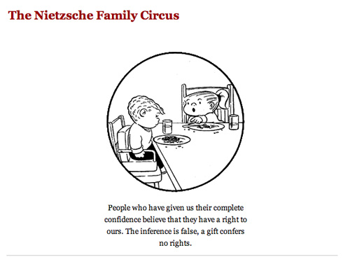
Bill Keane’s The Family Circus appears in over 1,300 newspapers and is ‘read’ by millions of Americans each day of the week. It began in 1960 and is still going strong. Considering the generally low quality of most syndicated strips these days, it’s a bit surprising to me how often this particular one panel cartoon comes up for ridicule/parody/rants/angry criticism. Yes, it’s bland and unfunny but so is Beetle Bailey, right?
Anyway, here’s a truly twisted take that I have to imagine even its creator might appreciate: The Nietzche Family Circus which pairs a random quote from the philosopher with a random Family Circus panel, see example above. Now someone has to do the same thing with Batman and Robin and John Rechy’s City of Night. . .
The US Postal System is Near Collapse – Business Week
May 30, 2011
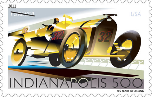 If you want to understand the crisis in the US postal system, you need to read this article in Business Week. I hope that steps are taken to avoid this reaching a crisis in 2011. The easiest one, in my view, is eliminating Saturday delivery. I’ve advocated that position for years, if only to my local mail carrier. They could also try serving cocktails at the post office. . .this would make the long lines easier to bear, especially in the summertime. Just a thought.
Free Photoshop brushes – Smoke Effects
May 30, 2011

There are 33 sets of excellent Photoshop smoke effect brushes collected here on the YouTheDesigner web site, all free and available in various downloadable formats. If you need smoke effects for a design project, I’m sure you can find what you’re looking for in this great collection.

Four Color Process – Adventures Deep Inside the Comic Book
May 11, 2011
Click image for larger size.
John Hilgart’s Four Color Process gallery at Posterous accurately lives up to its sub-head, “Adventures Deep Inside the Comic Book.” You’ll find a year’s worth of posts that feature close-up scans of sections of comic book panels. They vary from the recognizable to the abstract. One feature in common is that they all feature a visible dot pattern from the four color printing process.
The idea was akin to Pointillism in painting. Use patterns of dots in four colors (Cyan, Magenta, Yellow & Black) that combined to create a multitude of colors. If not the 16 million colors of computer screens today, the resulting combinations worked, if somewhat garishly and imprecisely.
As the Hearst papers claimed in 1896, “Eight Pages of Iridescent Polychromous Effulgence That Makes The Rainbow Look Like A Lead Pipe!”
Registration errors abound where the printed color of the object spills over the black holding lines of the artist’s inking job. I remember having a fair tolerance for these slips when I was reading 12 cent comic books on pulp paper.
Some of Hilgart’s selections exist in the visual area where images break down into pattern. (Hey, it worked when Roy Lichtenstein swiped from Joe Kubert and hung the result in Leo Castelli’s gallery.) Click image for larger size.
 Improved printing processes, digital work flows and better paper stock have made this earlier comic book work appear somewhat crude. But the distinctive look of four color printing on pulp stock is also one of it’s charms. It helps set the image in time.
For about a century this four color process was used for mass market publications. During their WWII heyday a popular comic book would sell a million or more copies a month. Nowadays a comic book whose sales are measured in tens of thousands is considered a hit.
So please check out 4CP and explore the ‘hidden’ art of the comic book panel.
Design Tools Monthly – Essential for All Designers
January 26, 2011
I can’t believe that I’ve never written up Design Tools Monthly (though I have featured info from them in the past). DTM is billed as “The Executive Summary of Graphic Design News” and I’ve been a subscriber for more than a decade (they began back in 1992). It is that summary and much more.
They used to have a pitch on their mailing envelopes that presented two options: you can spend all your time keeping current with all the new software, hardware and graphic design news OR you can make a living doing graphic design and read DTM. I think that is on the money.
I’m a long time subscriber to MacWorld, Mac|Life (formerly MacAddict) and Photoshop User (published by the National Association of Photoshop Users) and between them they do a pretty good job on keeping me informed about Mac-specific news.
But DTM monitors those magazines (and websites) and a host of others, including Creative Business, Graphic Design:USA, InDesign Magazine, CreativePro.com, MaxFixIt, MacInTouch, MacNewsNetwork, The Mac Observer, MacUser, InDesign Secrfets, Planet Quark, MacUpdate and Web DesignNews.
In addition to the monthly newsletter editor Jay Nelson and contributor Jeff Gamet host a free podcast Design Tools Weekly that covers some of the same items you get when you subscribe.
If you are a designer, you simply must check DTM out. On their website you can get a free PDF of a sample issue to help you decide. There’s also a reduced subscription rate for freelancers, teachers and students.
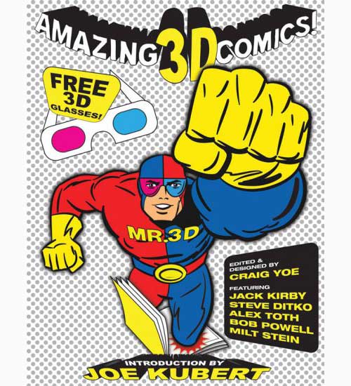
“Amazing 3D Comics” – Best of 1950’s 3D Comic Books edited by Craig Yoe
November 12, 2010
Oh, yeah – this is gonna be sweet! Eisner Award winner comics expert and designer Craig Yoe collects the best of 1950s 3D comics by such legendary talents as Jack Kirby, Steve Ditko, Alex Toth, Russ Heath, Al Jaffee, Bob Powell, Milt Stein and puts them between hard covers.
Re-mastered and restored, these works represent every genre: superhero, jungle adventures, horror comics, science fiction, funny animals, satire, western and romance! With a behind-the-scenes introduction by the mastermind behind 3D comics himself, Joe Kubert. Includes rare art and ephemera and a 3D lenticular cover.
Publication date: Feb. 1, 2011. Available for pre-order now from all the usual sources.
X-Ray Pin Ups? Actually, Digital Creations for EIZO Monitors Promotion
November 3, 2010
You may have seen these around the web recently and thought they were real X-Rays of pin-up models, something like the fantastic work of Nick Veasey. But they are actually completely digital creations by CGI Illustrator Carsten Mainz of the German advertising agency Butter for their client EIZO monitors. Check out the WIRED piece for a complete explanation, here. Click images for larger size.
‘What the Font’ helps you Identify Fonts
October 1, 2010
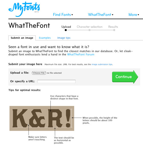
Have you ever seen a font on a menu or sign or in a magazine and wondered what it is? Perhaps because you think it would be perfect for a job you’re working on? Or perhaps because you’re a designer who’s simply font-mad like me?
Now there’s a new online service in beta from MyFonts.com called What the Font that allows you to upload an image file (up to 2 MB) and will attempt to match and identify the typeface.
Snap an image with your iPhone or other mobile device, prep it according to the site’s requirements, and upload it. If there’s no match in their database, there’s also a forum where you can post your type sample and see if anyone there can give you the name.
Apple Computer History by OnlineSchools.org
September 30, 2010
Here’s a neat chart that details the highlights of Apple’s history from the good folks at OnlineSchools.org. Click on image for larger size.

