Jack Kirby’s Collage Art – An Essay by Steven Brower
July 6, 2012
This April piece from imprint – Jack Kirby’s Collages in Context by Steven Brower – is an excellent examination of a little-explored aspect of one of the most popular artists of the second half of the twentieth century. It’s well worth your time to read it.
Did I mention that the artist in question is Jack Kirby, who worked in the once-critically disdained now fashionable and honored field of comic books? In these days with The New York Times covering the editorial decisions of DC and Marvel along with compiling a best-seller list for graphic novels, it would seem like a pretty good time to be a founding father of a massive vertical entertainment monopoly.
Unfortunately, Jack Kirby died in 1994 and did not live to see the incredible success of the superhero characters he created. Nor would he have shared in any of the flood of money generated by his creativity, the rights to work-for-hire comic book pages in the 1960s and 107os are owned in perpetuity by the corporation, not the artist.
When I read the stories that featured the collages Brower examines, the fact that they might be the topic of serious, academic treatment was completely off my radar. I couldn’t imagine such a thing being taken seriously by ‘the establishment.’ Although I certainly took in Kirby’s vision as raw, barely filtered, wildly creative art.
Here’s a Kirby collage that had not been previously published. It’s still pretty trippy even fifty years after it was created. Click on the image to see the entire collage.
Typing Two Spaces after a Period is WRONG. PERIOD.
May 23, 2012
Farhad Manjoo of Slate writes a delightful piece on a common typing error that will be overly familiar to any designer who sets body copy in any format, print or web: Space Invaders, Why you should never, ever use two spaces after a period.
Here’s a short excerpt:
“Who says two spaces is wrong?” they wanted to know.
Typographers, that’s who. The people who study and design the typewritten word decided long ago that we should use one space, not two, between sentences. That convention was not arrived at casually. James Felici, author of the The Complete Manual of Typography, points out that the early history of type is one of inconsistent spacing. Hundreds of years ago some typesetters would end sentences with a double space, others would use a single space, and a few renegades would use three or four spaces. Inconsistency reigned in all facets of written communication; there were few conventions regarding spelling, punctuation, character design, and ways to add emphasis to type. But as typesetting became more widespread, its practitioners began to adopt best practices. Felici writes that typesetters in Europe began to settle on a single space around the early 20th century. America followed soon after.
Every modern typographer agrees on the one-space rule. It’s one of the canonical rules of the profession, in the same way that waiters know that the salad fork goes to the left of the dinner fork and fashion designers know to put men’s shirt buttons on the right and women’s on the left. Every major style guide—including the Modern Language Association Style Manual and the Chicago Manual of Style—prescribes a single space after a period. (The Publications Manual of the American Psychological Association, used widely in the social sciences, allows for two spaces in draft manuscripts but recommends one space in published work.) Most ordinary people would know the one-space rule, too, if it weren’t for a quirk of history. In the middle of the last century, a now-outmoded technology—the manual typewriter—invaded the American workplace. To accommodate that machine’s shortcomings, everyone began to type wrong. And even though we no longer use typewriters, we all still type like we do. (Also see the persistence of the dreaded Caps Lock key.)
Pictaculous – Free Color Palettes Based on Your Images
May 4, 2012
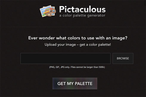
Here’s a nifty little service brought to you by the fine folks at mailchimp, the free email marketing service. It’s called Pictaculous and it does one thing wonderfully well. You upload an image and it spits back a color palette based on it. I find this sort of thing very useful in the early stages of a design project for limiting my color selections to a range of compatible choices. (It’s also a nice way to jump-start a project you may be stuck on).
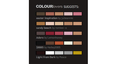
Restrictions are file formats of png, gif & jpeg only and a file size of 500k. You can download an Adobe Swatch File (.aco format), view the HTML color codes or see what COLOURlovers suggests. BTW, COLOURlovers is a great site to get color inspiration from. They’ve got over 2 million user-created palettes to scan through.
How to Bleach Images in Photoshop from Mac|Life
April 21, 2012
The bleached out color effect is a popular one these days and you may have wondered exactly how this is achieved. This tutorial on the “bleach bypass process” by Rob Lawton from the Mac|Life website shows you how to do it in clear, easy to follow steps.
I’ve been a subscriber to their print magazine since it was called MacAddict and was the first American Mac-centric publication to include a CD-ROM with each issue back in 1996.
The editorial tone is far less fannish and insular these days and more accurately reflects the broad appeal of Apple products to the audience beyond the fanboys. They used to have an inane stick-figure mascot named Max and their reviews used to rate software and products from “Blech” to “Freakin’ Awesome.”
At that time it always seemed to me a mash-up of skate-board kulture and computing. Adults would hide their copies behind an issue of the more mainstream and respectable MacWorld (where New York Times tech columnsit David Pogue got his start).
Today no one needs to hide their copies of Mac|Life; it’s been one of the most successful re-brandings of a print publication in this new century, IMO.
Dain Fagerholm’s Stereoscopic Drawings
March 29, 2012
Seattle-based artist/illustrator Dain Fagerholm is making excellent use of the classic Compuserve GIF (Graphics Interchange Format) to create wobble-stereoscopic drawings (see examples below).
The second version of the GIF format (released in 1989) supported animation on multiple file layers with a palette of 256 colors and has been responsible for some of the most annoying visuals on the web since the early 1990’s. So it’s wonderful that after all this time – and the rise (and fall) of Flash and HTML5 – someone is using it to create real art.
The illusion of depth is compelling and the charm of these low-tech, hand-made creations is captivating. Please check out Dain’s website and support this artist’s unique work.
Optical Illusion of the Day
March 26, 2012
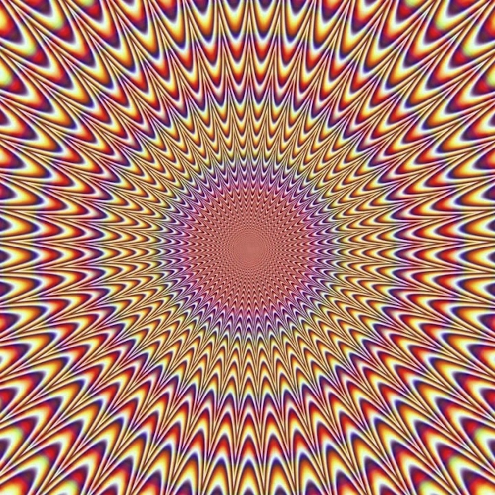
I found this one on the InterWebs today and thought it was worth sharing. I didn’t find any credit for it, so if someone knows who created it I’d be happy to acknowledge their artistry. The illusion of kinetic motion as your eyes scan this design is very impressive. Click on image for larger size and best effect.
The Rolling Stone’s “Lips” Logo was Created by Jon Pasche, not Andy Warhol
March 26, 2012
Credit Where Credit is Due Department: I’ve read over and over again that Andy Warhol created the lips and tongue logo for the Rolling Stones and would like to put this canard to rest once and for all. The original artwork (below) for the design is now in London’s Victoria and Albert Museum.
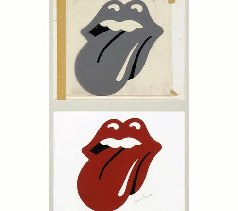
From their website:
“Designed by John Pasche in 1970, the pop art design perfectly encapsulated Mick Jagger’s sensuous lips and the band’s rebelliousness and has been in continuous use by the Rolling Stones ever since.”
“Pasche was commissioned to produce the logo after Jagger approached the Royal College of Art in London in 1969 to help him find a design student – the Stones had been frustrated by the bland designs offered by their record label Decca Records. Subsequently, Jagger visited Pasche’s degree show and this led to discussions for a logo and other work for the Stones’s own label, Rolling Stones Records, after the group’s contract ended with Decca Records in 1970.”
Great Mac Software Bundles – at Great Prices for a Limited Time
December 15, 2011
MacUpdate is offering a bundle of 12 applications, including the essential repair utility Tech Tool Pro 6. A total retail value of $741 for only $49.99 (a 94% discount, saving you $691). As of this writing you’ve got 6 days to take advantage of this offer.
BundleHunt is also offering 12 applications for $49.99, (95% off a full retail of $1,100). Six are design-oriented and six are general Mac apps. Included are 14 e-books, listed below:
- Mastering CSS for Web Developers
- Professional Web Design, Vol. 2
- Getting the Hang of Web Typography
- Mastering Photoshop for Web Design, Volume2
- Create Selling eCommerce Websites
- Mobile Design for iPhone & iPad
- Mastering Photoshop for Web Design
- Successful Freelancing
- Professional Web Design
- Creative Set for eBook Design
- Book 1: Where Stellar Messages Come From (55-page PDF)
- Book 2: Formatting & The Essentials of Web Writing (54-page PDF)
- Book 3: Headlines, Subheads & Value Propositions (52-page PDF)
- Book 4: Buttons & Click-Worthy Calls to Action (55-page PDF)
“Just My Type” by Simon Garfield: My Favorite Book So Far This Year in Any Category
September 10, 2011
Just My Type by Simon Garfield is a unique book about a subject that is all around us and, except for professional graphic designers, mostly ignored by the general public.
However below the radar the subject of typefaces may be, it is also abundantly clear that they exert an enormous influence on how we perceive the written word. In everything from brand logos, the headlines and body copy of newspapers and magazines and, of increasing importance, in all digital user interfaces from the Web, smart phones to eReaders and tablet computers.
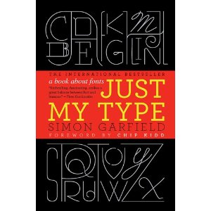
This book is sure to be on this Christmas’ wish lift for every graphic designer you know, but I would argue his real achievement is to take a niche subject and make it thoroughly engaging for the lay reader. Everyone is confronted with a variety of fonts every day, they are literally unavoidable. So I’d make the case that this book can be rewarding to every reader, not just those with a professional stake in the game. Because the story of typefaces is, at its root, also the story of people and communication.
26 letters plus a variety of numbers and symbols (ligatures, accents, fractions and dingbats) yield an almost infinite variety of styles, past, present and future – new typefaces are being designed and released every day. And all more accessible than ever before to the average computer user – even if all you ever type is a business letter – from the drop down menu in your word processor of choice. We can thank Steve Jobs and his college course in calligraphy for the early emphasis on good fonts in the personal computer market.
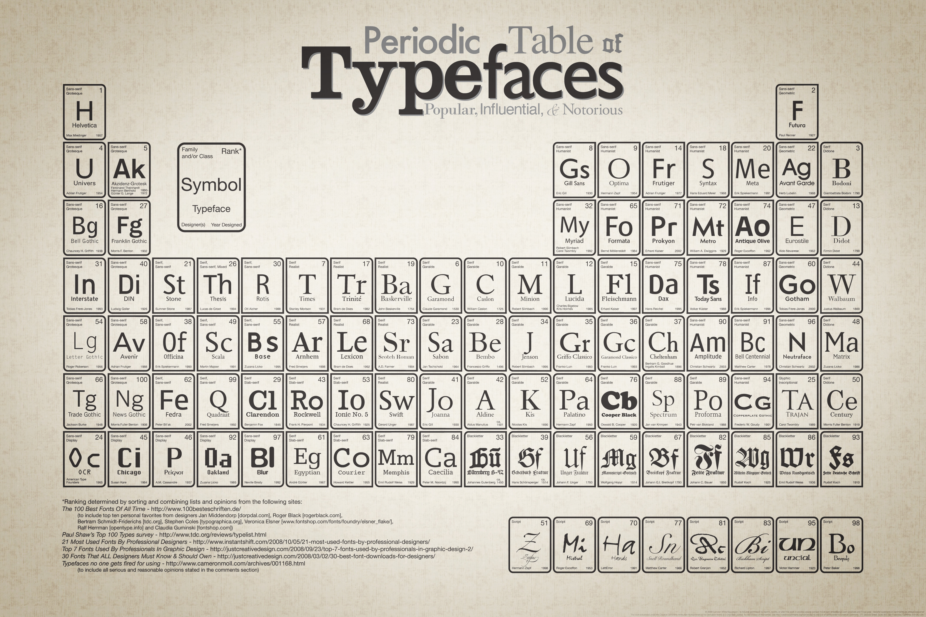
Garfield uses short chapters and abundant illustrations of his subject matter that include both biographic and historic detail that I found fascinating. I learned perhaps more than I ever wanted to know about the personal life of the creator of one of my all time favorite typefaces: who would’ve thought that a book on fonts could include topics like incest and bestiality? (It’s ranked number 8 on the chart below).
The take-away? Just My Type is my favorite book so far this year in any category and carries my highest recommendation. Buy it, read it, give a copy to every graphic designer you know.
Here’s a wonderful chart that’s used as the end papers of Garfield’s book, the Periodic Table of Typefaces – Popular, Influential & Notorious.
Click on image for larger size. Note: Full image is 3150 wide by 2100 pixels high.
There are No ‘Colors’ There is Only Light
August 24, 2011
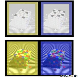
The grey tiles on the left look blue and the grey tiles on the right look yellow. But they are grey in each image.
Beau Lotto is appearing on the BBC’s Horizon show with a program called Do You See What I See? about color perception where he explains that color (or colour) is not in the objects we perceive, but rather manufactured in our brains. The conclusion he draws from this is, I think, wonderful.
So we all see the world differently. Indeed, we have no choice about this because our experiences of the world are necessarily different. None of us sees the world as it is. In this sense we are all delusional, what each of us sees is a meaning derived from our shared and individual histories. This awareness, possibly more than anything else, provides an irrefutable argument for celebrating diversity, rather than fear in conformity. Which is liberating, since knowing this gives you the freedom (and responsibility) to take ownership of your future perceptions of yourself and others.

